Dear Jeff: You are the fourth richest man on the planet. Today, the world now relies on Amazon to buy everything from vitamins to electronics, to toys and books. But instead of a smooth, intelligent interface, the experience makes me feel like I’m shopping at the digital version of a rickety old general store. Jeff, here are a few pointed elements for you – and your 110,000 employees – to improve.
1. Orange Is Not The New Green
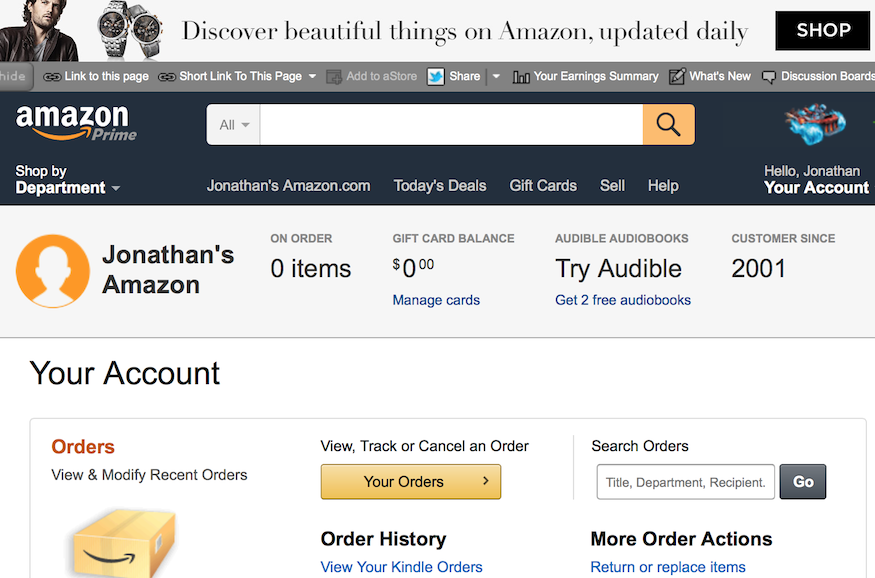
Jeff, you love orange. Amazon review stars are orange. Hover over Amazon links and they turn orange. Buy buttons are orange. Black menu buttons turn orange. I’m trying to get a bead on your orange addiction. Is this because there’s a curved orange arrow in your logo?
Jeff, that’s not a good reason.
Similarly, Amazon “change order” buttons are gray, and become slightly darker when you click on them. Random stuff is green – say, my reward points or delivery dates. Click on a blue link and it becomes green. Click orange and it stays orange. Red seems to be the color used for dollar amounts, but then the words “Kindle app” are randomly red, (maybe because that’s your product). Color favoritism just isn’t fair.
Meanwhile, other sections of Amazon, such as careers, sport a totally different color zeitgeist, as if we just left Amazon land.
Jeff, I know you’re a math geek and went to Princeton. But numbers are not everything. There are multiple philosophies of color theory and interface design. Most people are not color blind. Please hire a UI designer and get to work. We just want to buy more stuff.
2. Help Us Buy and Ship Stuff
Jeff, I have personally contributed tens of thousands of dollars in Amazon purchases to your pile of billions. Yet you lack empathy for the needs of your preferred customers. Today, I checked and found my account is cluttered with 97 shipping addresses. There’s nothing intuitive about your antiquated shipping management interface. (Strangely, addresses appear to be sorted alphabetically by first name, with no obvious way to resort them; they should be sorted by frequency or recency.) I started deleting old addresses, and found that to do so I had to perform that task one address at a time, and each time, I would end up back at the top of the address list and have to scroll down to find the next one I wanted to delete. This made me feel as if the interface hadn’t changed since I met you in 1997 at your then-shoebox-sized Seattle office. You had some hair then, three shirts hanging in your tiny closet, and an unfinished door for a desk propped up with 4-by-4s for legs, with a sleeping bag underneath (I was writing a lengthy article about you, in those pre-billionaire days, for the July 20, 1997 issue of the LA Times Magazine.)
In 2015, shouldn’t your customers be able to intelligently sort their shipping addresses, and select 5, 10 or 20 at a time to delete?
Next, let’s say I want to ship to a new person. I click on “Change address.” This takes me to “Choose a Shipping Address.” Then I see my list of 97 shipping addresses. What I expect to see is a line at the top that says, “Enter a New Shipping Address.” Instead, you force me to confront the ghosts and one-offs from my past, and scroll all the way down to the bottom of the page, where a tiny line reads: “Ship to a new address.”
Jeff, here’s a small piece of advice. Step away from some of your silly space rocket playtime and return to Earth to take the trouble to actually use Amazon. Play with the interface that made you $46 billion. Spend an hour tooling around your site with a professional UI designer, observing the arbitrariness of your color theory, the clunky interface and disjointed shipping process. You’re a smart guy. The time has come to elevate Amazon from its hokey retro general hardware store look to the 21st century.
Most of us aren’t headed into outer space any time soon. We just want to buy more stuff. And here’s the good news. An interface upgrade will cost you a whole lot less than a rocket ship.