Modern life is the interface, the space where you engage, buy, and say yes. It’s the highly designed screen on your smartphone, tablet, laptop, or kiosk. It’s how a store coaxes you to part with your money through conscientious design, layout, authenticity, or the element of surprise. Get it right – think Uber – and you win new business and a loyal, growing fanbase. Get it wrong, and customers turn away in confusion.
Last week, while checking out at the upscale Woodlands Market grocery in Tiburon, California, across the bay from San Francisco, I got an object lesson in the fundamentals of design thinking and prototyping, including how important it is for big companies to focus on these principles. I was simply trying to pay for a drink and snack, through a VeriFone terminal made by NCR.
NCR, once known as National Cash Register, has dominated America’s checkout stands for well over a century. Founded in 1884 with the objective of manufacturing and selling the first cash registers, no less than Thomas J. Watson was an early employee. According to company lore, Watson once interrupted a dull NCR sales meeting with the spirited outburst: “We don’t think enough!” He then wrote the word THINK on an easel, a motto that was soon erected on signs in factory buildings, sales offices, and club rooms throughout the company. After Watson was fired, “Think” became a rallying cry for his new enterprise: IBM.
Thinking smartly, carefully, deeply – this is what matters when designing the perfect interface for an app, website, kiosk, or grocery store checkout terminal. Design Thinking is what NCR needs to do in 2015 – by understanding that color, emotions, sequence, and logic matter. The company would also benefit by listening to customers and learning from its mistakes. That’s Consumer Empathy 101.
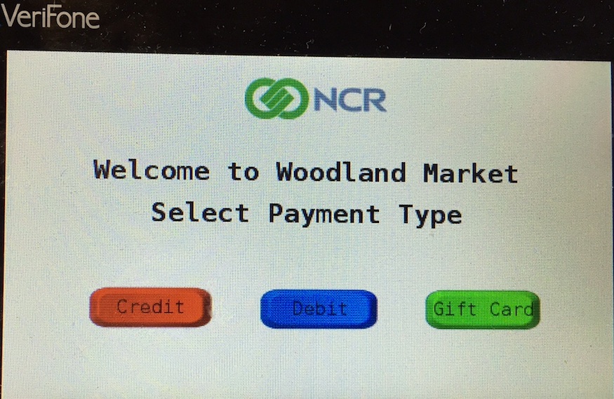
Here’s why. Standing at the NCR VeriFone terminal at Woodlands, I swiped my AmEx card. The next screen offered three choices of payment: Credit (a red button), Debit (blue), or Gift Card (green). As any small child can tell you, red means “stop”, and conjures up negative associations such as fear or alarm. Indeed, standing at the Woodlands checkout, I skidded to an anxious stop, and then mistakenly jabbed the green button – for a gift card. Bad design deserves the bulk of the blame. Credit card, the most common choice, should have been in green, followed by the debit card in blue. What about the gift card, probably chosen by shoppers less than one percent of the time? It should have been in another color. Definitely not red. (Another thought for would-be designers – up to 8 percent of males are color blind.)
It gets worse. Fumbling through my transaction a second time, I eventually made it to the final screen: “Is $6.26 O.K.? Press YES or NO.”
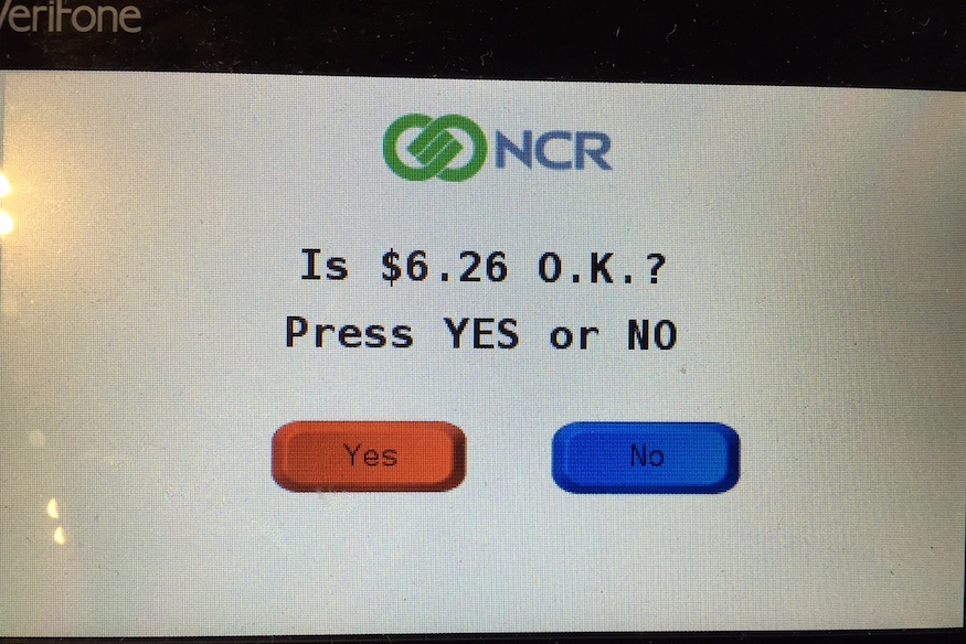
The picture speaks for itself. A giant red “Yes” button? The sales clerk chimed in. “Yeah, it’s terrible. Nobody can figure it out.”
True.
I went back to this market multiple times. My editor accompanied me on one visit and noted immediately that “Woodland Market” on the terminal was misspelled, missing its “s”. (This is why writers and companies need editors.) Several different clerks groused that customers are constantly complaining about the confusing checkout experience. Does NCR not prototype and test interfaces? Does the store itself not have any editorial control? Do any of the decision makers consider customer empathy?
What’s even more remarkable about this failure of design, prototyping and customer care is that NCR makes some very good terminals. This particular model just happens to be, inexplicably, backwards and counterintuitive.
Which proves that Watson was right: “We don’t think enough!”
UPDATE: Several months later, NCR has yet to do a proper redesign.