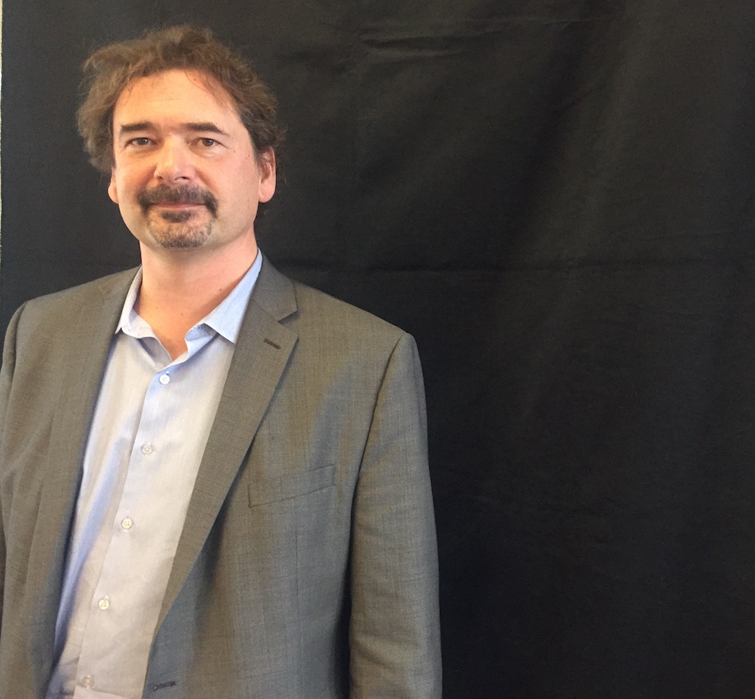
Jon von Tetzchner is an imposing man with a grand ambition: to build the people’s browser. His first creation, Opera, ran counter to mainstream browsers, and struck a chord with power and mobile users, drawing an impressive 350 million converts at its peak. But friction over conflicting goals – Tetzchner fought for Opera’s independence, while some investors sought to find a buyer after their public offering – led to him to leave and sell his shares in 2011 and 2012. When the new Opera management opted to “throw away the code we had written and start fresh,” the Icelander felt he had no choice.
Now back in force with Vivaldi, his new, feature-packed, community-driven browser, he’s completing his opus, designing the browser and company he always dreamed of – a browser for the millions of tech-savvy users seeking an alternative to the norm.
Tetzchner is an outlier in a tech universe that increasingly demands uniformity. Basketball-player-tall, with a shaggy mane and beard, he isn’t shy about promoting his vision. He once wagered that he’d swim the Atlantic if Opera downloads hit a million in just four days (when they did, he took to the frigid waters, but didn’t swim far. As he tells it with a wry grin, he was foiled by a failing support boat). Rejecting the often self-absorbed path of many Silicon Valley entrepreneurs, Tetzchner believes in giving back to his native Iceland, and championing a more holistic, socially responsible model for tech firms. He’s funded several startups in Iceland, and created an Innovation House for startups and co-working in Oslo (where most of his team works) as well as another near his adopted home in the historic fishing village of Gloucester, Massachusetts. We caught up with Jon von Tetzchner and his co-founder, Tatsuki Tomita, during his recent visit to San Francisco.
Why should the world care about Vivaldi?
We spend a lot of time on the internet. Some of us actually live there for hours every day. We all need a browser, and most of the current browsers have a philosophy of simplification. They’re trying to get out of your way, letting you focus on the content. It sounds good …. except that the browser is a tool to organize your life. And with a tool you spend so much time with, taking away all the features, just doing the most limited of things doesn’t really make sense to me from a design philosophy. This camp is typically based on statistics. Anything that doesn’t get widespread use gets removed, and they make something that works well for some imaginary average person.
But the reality is that everyone is different. We wear different clothes and like different things, and we think there’s no such thing as this average person. Instead what we do is take input from individuals, and by aligning ourselves with those individuals we wind up with a browser that is flexible and adapts to your needs.
We work closely with our community of users. We have volunteers – hundreds of them – who help us translate the browser and test it, which allows us to have more than 50 languages. They also test it. Every day we send them a new version, and we get feedback on what they like, and don’t like. Then about every week we send out updates to the greater community which is on our community site. People give us feedback, and we have a thread where people give us ideas on the features people would like us to do next.
The Feature-Rich Browser
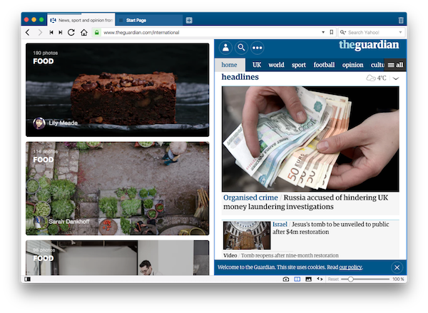
The others take out all the features, and we are putting a lot of features in. Say you have too many tabs open, how do you deal with that? We are thinking about that problem. We created Tab Stacks, which allows you to organize your tabs in a folder with a sort of overview. I have 40 to 50 tabs at any one time, and I know people who have hundreds open at one time. So I put them into these [Tab Stack] folders depending on how they relate to each other. You can show them side by side. Maybe you have a grid you’d like to keep open, with updates happening, or you’d like to do comparison shopping.
Our Panel is our toolbox. You can have your bookmarks, downloads, history, and Notes there, as well as web panels and frequently visited pages. It’s something like a TweetDeck or a thesaurus. Something you use while working on other content in the browser.
Notes is a little bit more than a bookmark. You select a piece of text you’d like to use in your next report or presentation, and designate “add to note.” It adds the text, where you found it, and a screenshot just in case it happens to change.
Traditionally, people use the mouse to select things. It’s a nice visual way to work. But a lot of us learn keyboard shortcuts, and they’re more efficient. So we have a lot of keyboard shortcuts.
Then we have advanced functions like the concept of fast forward. Let’s say you’re in a Google search and are going through the pages with the spacebar and come to the end of a page. It automatically takes you to the next page instead of your having to find the “next” [page] button. There are lots of details like this. Maybe you only use a fraction of them. But they make your process a lot more natural.
Vivaldi’s Inspiration and Origins
Back at Opera, there was a decision to throw away the code we had written and start fresh. They retained the name and started with a new browser with a different design philosophy in 2013. That created a difficult situation. A lot of people had selected our browser over the years, and now these people were unhappy. They asked me, “Can you do something?”
Obviously there was nothing I could do at Opera. But I could start a new company. So I started to build a browser with Tatsuki and a number of others. With the idea that, OK, there are definitely users who used to like us, who don’t like the direction of the company. The first new Opera that came out didn’t even have bookmarks. When you go from a very rich functionality to none, that’s a pretty big change.
I thought, “Can I make Firefox work the way I want to? Can I make Chrome work the way I want to?” And the answer was no. Adding a number of extensions would not resolve the requirement. And if no one else would build it, you build it yourself.
We launched in April of 2016, and we’re closing in on our first million active users. Japan is number one, then the US, Germany and Russia. We need to get 3-5 million to break even. That’s our first goal, and then we take it from there. We don’t want to go public. We don’t want to get investors. We just want to build great products and have nothing between us and our users.
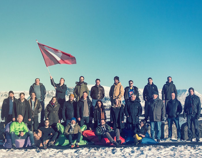
I am funding the company, and everyone who works here has a stake. We are 35 people, with the biggest chunk in Oslo, the second biggest in Reykjavik, and a smattering in the US, Finland, Russia and the Czech Republic.
The revenue model is relatively simple. You do [revenue sharing] search deals, and have default search engines. We include some bookmarks, and a tiny fraction of them generate income. Our calculation is based on about one dollar per user per year, something that we calibrated that we were making at Opera (which peaked at 350 million users). With the size of our organization, 3 to 5 million users per year breaks even.
Why the World Needs More than One Browser
Innovation stops when there’s only one choice. We saw that with Internet Explorer. They had roughly 85 percent of the market, and were looking like they would take a hundred percent. They had managed to kill off Netscape. It was pretty dire. The question was would Microsoft be able to control what we see and what we do (on the internet). That’s a bad situation. But also, technically, after they made IE4 or 6, they even dismantled the team. Their concept was that you would move over to Microsoft technology instead.
At the time we (at Opera) got together with a group of people from Mozilla and Apple, and we started to make new standards which turned out to be HTML5. A lot of that work was done by our people (in the 2000s). Microsoft was a strong force for a long time, and it was hard to get anything done because why would anyone be interested in web standards that the dominant browser didn’t support? But we managed to turn it around, and suddenly Microsoft was in a defensive position where they had to go out and implement those standards.
It shows what happens when there’s a dominant player that has no need to innovate.
Adapting to People
My father is a professor in psychology in Oslo who specializes in children with disabilities. This concept we have at Vivaldi of adapting to people – well, for a number of people, it’s not even a choice. In the beginning, we put in simple keyboard short cuts, partly for the people who had problems pressing multiple keys at one time. But it’s great for advanced users too. The same applies for zooming. And for certain groups (such as the visually impaired) it’s great to be able to see bigger [versions of] content. We adapt to people whether they have special needs or special hardware, or limited mobile phones.
If you want it to work in a certain way – and it’s something we can reasonably do – we tend to do it.
Why Spend Your Life Creating Browsers
It’s very fulfilling to build software that people like. You have to work for every single user and win them over. You do it by giving them what they want.
We win them over one at a time. Then they tell their friends. They are proud of their choice. The difference is our users have probably tried every browser on the market. And they’ve made a conscious choice. We don’t need to be the number one browser.
We just need enough users to break even.
