People around the world want to study design thinking and learn why it has relevance to their business, and now there’s a stunning example in my home city: a flagship Apple store that embodies the spirit, practicality, and vision of design thinking.
While you can get a sense of what I’m talking about in the accompanying photos, there’s much more to be discovered in person. This is an example that needs to be seen, felt, and experienced. For a full immersion in history and context, start your tour at the foot of Post Street, a posh avenue lined with luxury watch and fashion boutiques. Step in for a moment to take in the elegance and simplicity of the Burberry store at 225 Post. At Burberry, Angela Ahrendts rejuvenated the traditional English fashion brand through artfully trimming the product line and toning up store displays, while embracing a broader, world vision about the centrality of design.
Keep in mind the minimalism and artful curation that you glimpsed at Burberry, continue walking west up Post Street, and you will soon see why Apple got its money’s worth and more in hiring Ahrendts two years ago. Today, she heads Apple retail worldwide – both online and the company’s 479 stores worldwide. She’s not merely the only female executive at Apple, she’s arguably one of the most complete practitioners of design thinking in the world of tech. Yes, the industrial design legend, Jony Ive, and the late, great Jobs, imagined, designed and brought to market the products that power the Apple universe. But Apple’s future success may depend largely upon Ahrendts’s ability to continue conjuring up remarkable physical human experiences in an ever-expanding global network of stores.
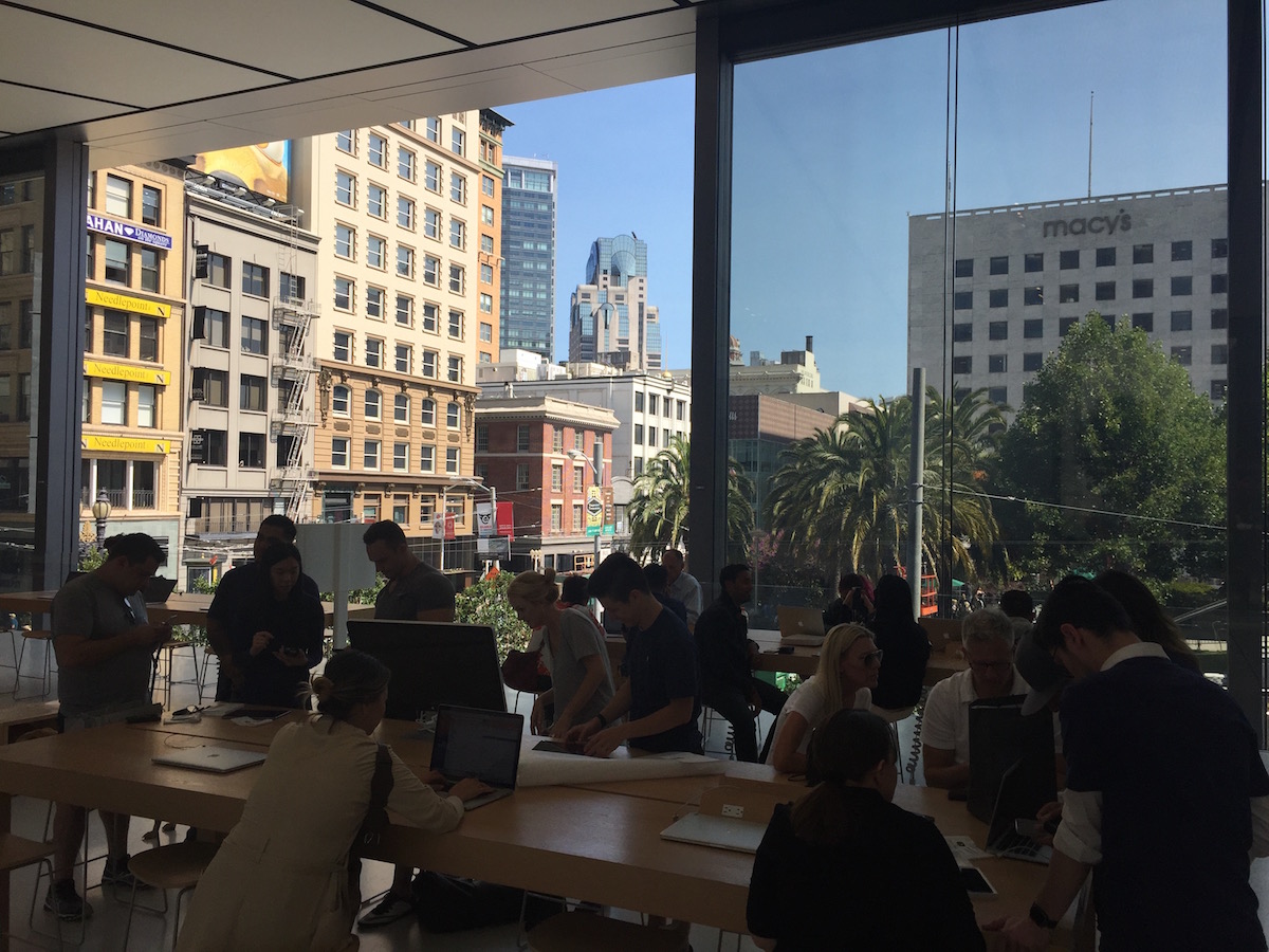
San Francisco’s Apple store, designed in partnership with the UK firm of Foster and Partners, boldly announces itself on the northeast corner of Union Square, the locus of luxury shopping in the city, and a thriving plaza in the best European tradition.
The gigantic, gleaming silver box features colossal 42-foot sliding glass and steel doors that dramatically open onto the square, conjuring up visions of Frank Gehry’s free-flowing engineering masterpieces. Trees framed in elegant white ceramic pots dot the entrance, increasing the sense that the store merges seamlessly with the square.
The invitation to enter is subtle yet pervasive. A pair of cascading million-dollar glass staircases line both ends of the store, and in the center sit the classic famously simple and cleanly built wooden tables showcasing phones, tablets and laptops. At the back are what Apple calls “windows” – curated, seasonal displays hosted by “creative pros” who offer advice and tips on iPhone photography, Apple Music, and iOS apps.

But you must scale the glass staircases to the cantilevered second story to experience a unique San Francisco trip. From that high vantage point, through the open tall glass doors, framed by nearly invisible deck rails, the second floor renders a dreamlike effect. Visitors are drawn outward toward the edge, where there seems to be no border or limit, almost as if magically suspended in the air, immersed in a spectacular vista of Union Square.
At the recent opening, Ahrendts and Ive spoke of how they view the San Francisco store – and hundreds more around the world – as bridges to local communities, figurative and literal town squares. “The overarching vision of the future of Apple retail … is what do we want Apple’s role in the community to be,” Ahrendts commented. “The store becomes one with the community.”
John Battelle of Newco has aptly viewed this as part of the maturation of the 40-year-old Apple, which is increasingly receiving a larger portion of its revenue from a variety of services, and becoming more open and generous with sharing that revenue with the app developers and artists propelling that growth.
The Genius Grove
The second floor features a room-wide mega-screen, designed to debut new Apple music exclusives and host creative talks and sessions with local musicians, artists, photographers and gamers (there are also tables used for classes and the new minimalist wooden stools found in Apple stores worldwide). But behind the big screen is a smaller, cozy space that to my mind represents the ultimate vision of Apple.
Remember those trees out front? Here, you’ll find Apple’s new “Genius Grove”, a metaphorical and physical update on the Genius Bar, a series of the same potted ficus trees rimmed with leather banquettes. Speaking to one of the Apple staffers, I learned the new routine: you make an appointment and wait under what some might call the “Tree of Knowledge” to then get human assistance or insights from your Apple Genius.
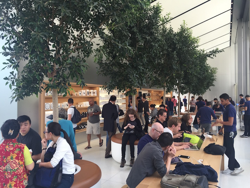
This cleverly designed interaction demonstrates both the whimsy and leadership of Apple. The company invented the “high-touch” service model of the Genius Bar, which Microsoft and others have attempted to mimic without success. But while the Genius Bar was an original idea – elevating and humanizing tech support – Apple, in the best design thinking, prototyping manner, is constantly experimenting with and evolving the experience and purpose of its stores and products. The Genius Bar was still fundamentally old school – representing a division and demarcation between the technician behind the bar and the customer – a physical and status divide.
The grove tucked inside the San Francisco store brings nature and a more holistic view of what it means to be a part of the Apple ecosystem. In design thinking speak, this begins with having all-important empathy for those who work and play with Apple products: the touchy-feely approach. Perhaps not surprisingly, Wall Street and even much of the tech world (for whom design thinking remains mumbo jumbo) still fails to fully grasp Apple. It’s always been about more than the hardware and software, about things that rarely show in the specs or the bottom line. Yes, there have been faster phones with better cameras and antennae and computers with superior engineering. And granted, Jobs was a genius with a dark narcissistic streak. But back in the day, when everyone else (IBM, Dell, etc.) was beholden to corporate America, Jobs had the guts and vision to sell to people and dreams. Not customers, but individuals.
Angela Ahrendts and Jony Ive deserve tremendous credit for taking that vision to the next step, here in this $23.6 million store that is a celebration of what makes Apple more than a tech company, a metaphorical and physical recognition that human creativity, and our need for connection, is what makes the world whole.
Oh, and if you don’t happen to need help with your phone or laptop, and just desire a place to work or hang, behind the Genius Grove is a sprawling outdoor public plaza, with free wi-fi and a 50-foot living wall.
Come see for yourself. It’s the power of design thinking.
