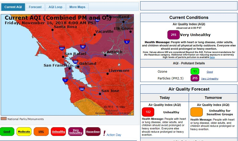
Quality of life in the San Francisco Bay Area is now seen in a number. The devastating and deadly fires trained a good chunk of California to begin the day by checking the AQI. For the last two weeks, people would quote the latest number at the gym, the coffee shop, grocery store, or office. Why did the Air Quality Index go viral? The rating system neatly combines color coding with a clear, numerical scale. Green, yellow, orange, red, purple, maroon: an artful example of design thinking. Data gains momentum when focused, and there’s a critical lesson here for those who want to build products and services to help people in need.
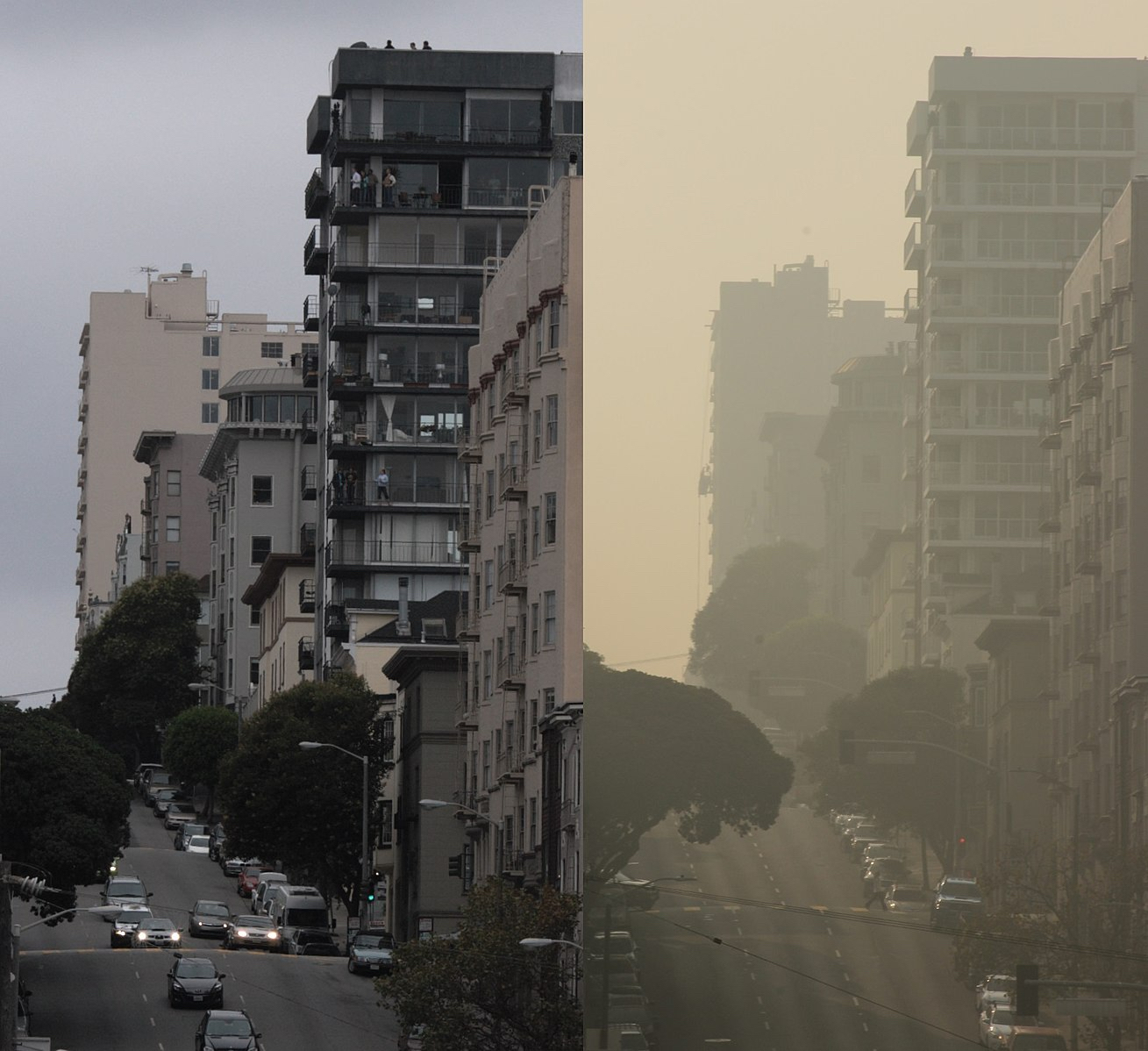
Franklin Street, SF, pre- and post-November 16, 2018
Within days of the Camp Fire to the east and the Woolsey Fire to the south, P95 and P100 masks in the Bay Area were sold out. Normally packed streets were eerily empty except for masked climate refugees, resembling zombies after the apocalypse. The sun strangely absent, not a breath of wind, the sky a deathly gray shroud. Schools and universities shuttered. Millions holed up indoors to escape the dangerous particulate levels. In San Francisco for work on the darkest, foulest day, we watched the AQI soar from the unhealthy rating of 200 to 271, hovering frighteningly in the purple danger zone. We were the lucky ones: we drove 200 miles to the Sierra Nevada for the luxury of breathing clean, healthy, level-20 air for a few days to flush out our damaged lungs.
Data to the Rescue
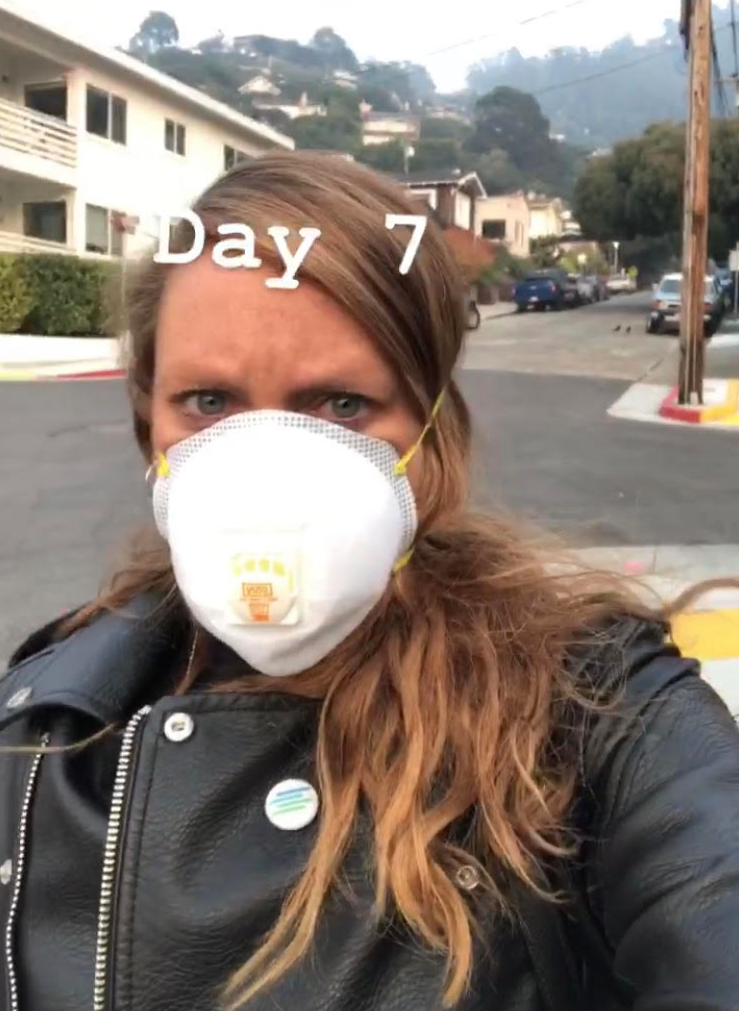
Kate Maxwell commutes to SF
But there may be a silver lining in this death cloud that instantly transformed San Francisco into the world’s most polluted city. The tragedy underscored how a clear data point can quickly become iconic. Millions could immediately grasp the importance of measuring the relative safety of the air we breathe in a telling image and number. Californians cared so much that the Environmental Protection Agency’s AirNow website servers buckled under the load of all the traffic. Dedicated EPA admins fast-prototyped a streamlined MVP by disabling the zip code search feature in favor of a statewide chart listing the indices of all the collection points.
The AQI demonstrates the power of a simple pollution index, showing how data may help battle the forces of ignorance. Wouldn’t it be great if consumers and citizens exerted their collective influence, demanding that the world’s nations and cities get tough on pollution? That we start talking about the Water Quality Index and roll out similar metrics like a Land Quality Index, Food Quality Index, and more?
The denial needs to end. Climate change is a real and present danger, underlined last week by a sobering federal report. Families have a right to demand a healthy environment. It’s long past time to push back. With knowledge. With awareness. With data.