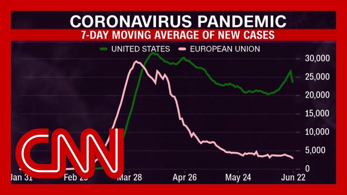
They say a picture is worth a thousand words, and this morning I saw a picture worth 10,000 words about numbers and death. CNN’s Dr. Sanjay Gupta showed a simple graph that underlined how America is losing our nation’s biggest innovation and entrepreneurship race to save lives and economies to Europe and Asia. “It did not have to go this way in Florida or the rest of the country in terms of the overall country, plateauing at 20,000, now 25,000 [infections] per day,” said Gupta, as he described the telling graph based on data compiled by John Hopkins. “People should look – this is what we’re comfortable with now – 20,000 people getting the virus every day. Several hundred dying every day. Look at the EU [with a larger population than the US and yet with roughly only 4,000 cases a day for the past month]. That’s what it should have been.”
Entrepreneurs seek scale, yet somehow our dysfunctional federal government, incompetent bureaucrats and yes, largely missing-in-action entrepreneurial leaders have misjudged the frightening speed at which a highly contagious virus can overwhelm a city, state or nation. Here in the US, we need only look south to see how this crisis might snowball. Brazil, bamboozled by a science-denying madman-in-chief, is hurtling into the abyss – with more than 55,000 new cases Sunday, and passing the 50,000-death milestone and a million infections. Meanwhile, Florida, Texas, Arizona, and several other US states are each seeing tremendous daily spikes in cases, each on the verge of mushrooming into mini-Brazils with overwhelmed hospitals.
Zoom Out for a Global View
Compare this exponential spread to what’s occurring in Finland and Norway, which together have seen just 16,000 total cases, fewer than 600 combined deaths (and very few new infections for their 10 million inhabitants). Likewise in Portugal, a nation of 10 million with nowhere near the resources of the US or northern European nations, only 1,530 have died. What do these nations have in common? They saw hospitals overwhelmed in Spain and Italy, and responded quickly. The citizens, entrepreneurs and governments acted rationally with widespread sheltering in place, mask wearing, and effective health care.
The virus may be invisible, but taking visible action could save hundreds of thousands of lives in the coming months. Dramatic societal behavior shifts, like community-based precautions of mask-wearing, sheltering in place, and not congregating in groups have been proven to deliver outsized, positive impacts. How else to explain the miracle that Vietnam, with a population of nearly 100 million, has just 349 cases and not a single death? Or that Thailand has suffered just 58 deaths, and not a single case of local transmission in the past 28 days? Many Asian countries have demonstrated coordinated, intelligent action in response to the crisis.
Here in San Francisco and nearby Silicon Valley we pride ourselves on understanding and acting on data. Yet Gupta’s enlightening illustration of the John Hopkins graph proves that parts of Europe are far safer to people and business than the many American states and cities in the midst of outbreaks. American communities, cities and countries need to start showing real-time data about how safe or dangerous it is to live in a region.
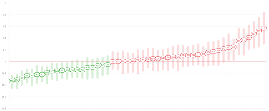
Rt Tells a Story
Governments and communities can lead with transparency and action. Americans have choices on where to live and work. We are not forced to stay in states or communities ruled by ignorance in the midst of this pandemic – such as the county in Arizona where the mask-hating (and now infected) Sheriff Mark Lamb has vowed to stop citing businesses who violate lockdown orders. We can reject stupidity and choose with our feet and our dollars. Give us more local graphs with breakdowns by city, county and state, and accurate, timely data. We need to be looking at Rt, a key indicator of how fast the virus is growing in a given population. What does that measure mean? A number higher than 1.0 means every person infected will infect more than one person. When Rt is above 1.0, the virus spreads quickly; below 1.0, the virus will die out. In the past couple of weeks, Florida has bumped up to 1.36. Oklahoma, the site of Trump’s first campaign rally: 1.45. Where do we stand in the San Francisco Bay Area? California, at 1.04, is hovering just above the key figure.
We deserve to know the facts. Give us meaningful, actionable data. How many people are known (and projected) to be infectious at any one time in a given population? What are safe activities during the pandemic? What are the costs to a community of flagrant non-mask-wearing, and other forms of non-compliance?
Health and safety are fundamental to life and work, and a core focus for innovation and entrepreneurship. That’s the true foundation to reopening economies. Here in the City by the Bay we’ve always seen ourselves as leading, but the data shows the virus is killing Americans (120,000 dead so far). Our response has been fractured, incompetent, politicized. Our president just announced that he told his people to “slow the testing down, please,” public madness that no European or Asian leader would dare voice anywhere, let alone a campaign rally. This is about our communities, our future. Einstein summed it up best with his oft-quoted phrase that insanity is “doing the same thing over and over again and expecting different results.”
How about we try science? Data. Reason. Stop complaining and start acting. Take back our cities and communities before it’s too late. As Gupta said, “The numbers are the numbers.”